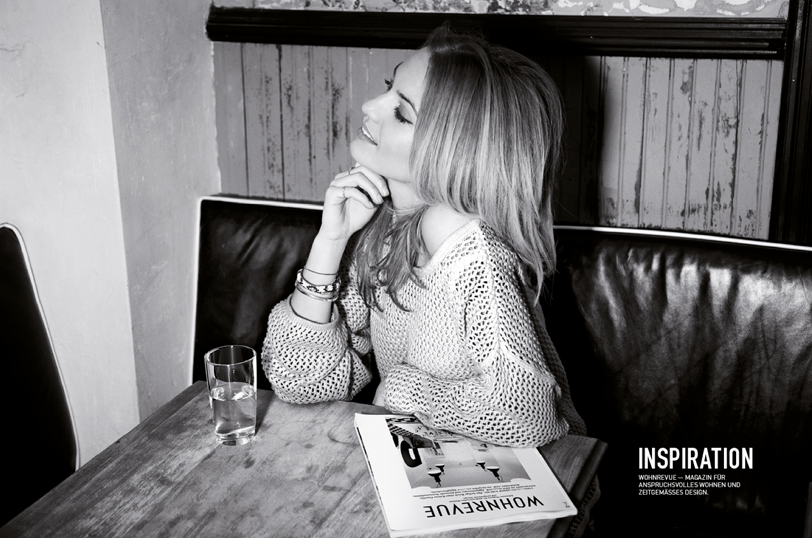
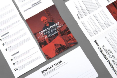
HUNZIKER — We have had a deep partnership with the company since our beginnings. We were not only able to implement the complete branding for them, but also countless other marketing measures and communication materials.

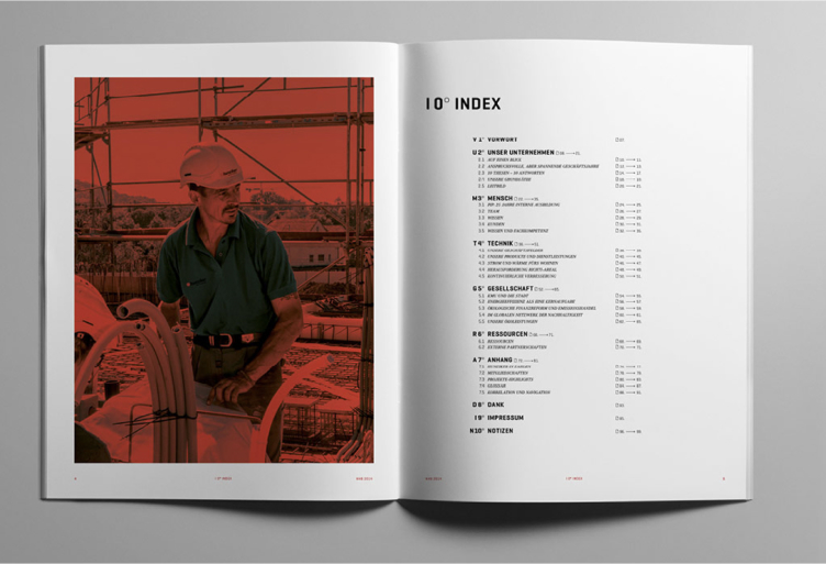
What particularly stands out are the two annual reports that we were allowed to create for the years 2018 and 2020. The former even won awards, which of course always makes us happy.
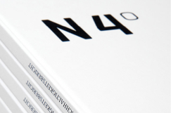
During design and production, we paid great attention to not only choosing the most sustainable paper possible, but also to ensuring that the reports can be used as valuable training tools.
The images shot especially for the annual reports tell the story of the many areas of the company in a striking and detailed way, while illustrations add another dimension.
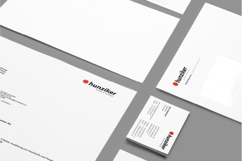
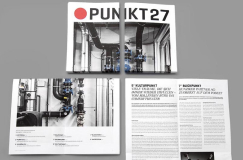
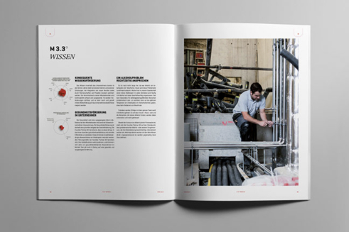
All of Hunziker’s branding uses a combination of two different typefaces, one embodying technology and having a modern grace, which the second strongly emphasises the humanity behind the services.
In all advertising material, this interplay comes into play strongly and the focus is on a visual appearance that is often mainly typographic. Of course, we don’t miss the opportunity to add to the icon library every now and then.
